

Data analysis in Python is all about diving into large pools of data and finding valuable insights that can help us make better decisions. With Python, data analysis becomes a very interactive task, engaging people in the data and allowing them to manipulate the data themselves to test their theories and assumptions.
In Python, we have many powerful libraries that make data analysis and visualization much easier. These libraries help us collect data, clean data, analyze data, and finally, visualize data to draw meaningful conclusions.
1. Pandas: Pandas are a highly popular library for data analysis. It offers data structures and operations for manipulating numerical tables and time-series data. You can use it to import data, clean it, and conduct exploratory data analysis.
2. NumPy: NumPy is a library that provides support for large, multi-dimensional arrays and matrices, along with a collection of mathematical functions to operate on these arrays.
3. SciPy: SciPy builds on NumPy and provides a number of algorithms and high-level commands for processing and visualizing data. It includes modules for statistics, optimization, integration, linear algebra, and more.
4. Matplotlib: Matplotlib is the go-to library for visualizing data in Python. It is highly flexible and can create a wide variety of plots and charts in many different styles.
5. Seaborn: Seaborn is a statistical data visualization library based on matplotlib. It provides a high-level interface for drawing attractive and informative statistical graphics.
6. Plotly: Plotly is a library that allows for interactive, online data visualization. It’s excellent for making complex plots more digestible and presenting large amounts of data.
Using NumPy for numerical computations
NumPy, short for Numerical Python, is a fundamental package for scientific computing in Python. It provides support for arrays (including multi-dimensional arrays), along with a host of mathematical operations to perform on these arrays. It’s particularly useful in the fields of linear algebra, Fourier transform, and random number capabilities.
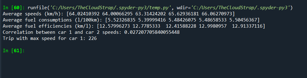
Let’s assume we are working on a project in automotive software testing where we need to analyze the speed and fuel consumption data of a fleet of cars. We want to use this data to calculate average speeds, fuel efficiencies, and other relevant metrics.
Here’s a somewhat complex example where we’ll use NumPy for our computations:
import numpy as np

# Let's assume we have collected data for 5 cars. Each car has data for 1000 trips.
np.random.seed(0)  # for reproducibility

# Generate random data for speeds in km/h
speeds = np.random.uniform(low=0.0, high=130.0, size=(1000, 5))

# Generate random data for fuel consumption in liters per 100 km
fuel_consumptions = np.random.uniform(low=3.0, high=8.0, size=(1000, 5))

# Let's calculate average speeds for each car
average_speeds = np.mean(speeds, axis=0)
print(f"Average speeds (km/h): {average_speeds}")

# Let's calculate average fuel consumption for each car
average_fuel_consumptions = np.mean(fuel_consumptions, axis=0)
print(f"Average fuel consumptions (l/100km): {average_fuel_consumptions}")

# Let's compute fuel efficiency in km/l for each car and trip
fuel_efficiencies = speeds / (fuel_consumptions * 1.0)
average_fuel_efficiencies = np.mean(fuel_efficiencies, axis=0)
print(f"Average fuel efficiencies (km/l): {average_fuel_efficiencies}")

# Compare two cars' speed using correlation
correlation = np.corrcoef(speeds[:, 0], speeds[:, 1])
print(f"Correlation between car 1 and car 2 speeds: {correlation[0, 1]}")

# Find the trip where car 1 had the maximum speed
max_speed_trip_car1 = np.argmax(speeds[:, 0])
print(f"Trip with max speed for car 1: {max_speed_trip_car1 + 1}")
In this example, we first generate some random data to simulate the speeds and fuel consumptions of 5 cars over 1000 trips. We then use various NumPy functions to calculate averages, fuel efficiencies, correlations, and maximums.
Please note that this is a simulated scenario for illustration purposes. The fuel efficiency calculation is not the most accurate, and real-world data may require additional preprocessing steps not shown here.
NumPy (Numerical Python) is a core library for scientific computing in Python. It provides a high-performance, homogeneous, and multidimensional array object (ndarray), as well as tools for working with these arrays. This makes NumPy a good library for algebraic and numerical computations.
Here’s an example of how NumPy could be used in the context of automotive software testing. Let’s assume we’re dealing with a fleet of test cars, and we have collected various measurements from these cars over time. This data could be used to identify patterns, calculate averages, and perform other analyses to evaluate the performance of the cars.
Let’s take a case where we want to analyze engine temperatures for a fleet of cars over a period of time to monitor for any anomalies. For simplicity, let’s assume we have readings for 10 cars over a period of 7 days.
import numpy as np

# Assume each car has 7 readings for 7 days in a week.
car1 = [90, 92, 95, 91, 92, 93, 94]
car2 = [91, 92, 90, 94, 92, 93, 96]
car3 = [92, 93, 95, 91, 90, 92, 93]
car4 = [93, 92, 96, 92, 94, 95, 90]
car5 = [94, 90, 91, 92, 95, 93, 96]
car6 = [92, 93, 94, 90, 92, 91, 95]
car7 = [91, 95, 94, 92, 93, 90, 92]
car8 = [93, 92, 91, 95, 94, 96, 90]
car9 = [95, 90, 94, 93, 92, 91, 96]
car10 = [90, 92, 93, 94, 95, 90, 91]

# Combine all car data into a single 2D NumPy array
engine_temps = np.array([car1, car2, car3, car4, car5, car6, car7, car8, car9, car10])

# Calculate the average temperature for each day
avg_daily_temps = np.mean(engine_temps, axis=0)
print(f"Average Daily Temperatures: {avg_daily_temps}")

# Find the maximum temperature for each car
max_car_temps = np.max(engine_temps, axis=1)
print(f"Max Temperatures for Each Car: {max_car_temps}")

# Find the day on which each car reached its maximum temperature
day_of_max_temps = np.argmax(engine_temps, axis=1)
print(f"Day of Max Temperature for Each Car: {day_of_max_temps}")

# Find any temperatures above a certain threshold
threshold = 95
high_temps = np.where(engine_temps > threshold)
print(f"Cars and Days with High Temperatures: {high_temps}")
In this code, we:
- Initialize the temperature data for each car.
- Combine this data into a 2D NumPy array.
- Use np.mean() to calculate the average temperature for each day across all cars.
- Use np.max() to find the maximum temperature recorded by each car.
- Use np.argmax() to find the day on which each car reached its maximum temperature.
- Use np.where() to identify any temperatures above a certain threshold.

NumPy’s array operations make it easy to perform these calculations on the entire dataset at once, without needing to loop through the data. This makes our code more readable and more efficient, especially for large datasets.
These insights can be very useful in automotive testing. For example, if certain cars consistently run hot, or if all cars run hot on a particular day, this could indicate a problem that needs to be addressed.
Working with pandas for data manipulation
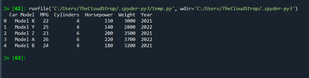
Pandas is an incredibly versatile library that’s used for handling and manipulating structured data efficiently. For a hands-on understanding, let’s assume we’re working with an automotive company and we’ve been given a dataset that contains various parameters for different models of cars. This could include information like fuel efficiency, engine power, weight, and manufacturing year.
Our task is to understand this data and draw insights that can help us understand car performance.
Let’s consider a small sample dataset:
import pandas as pd

# Define a dictionary containing car data
data = {'Car Model': ['Model X', 'Model Y', 'Model Z', 'Model A', 'Model B'],
        'MPG': [22, 25, 23, 26, 24],
        'Cylinders': [4, 4, 6, 6, 4],
        'Horsepower': [150, 140, 200, 220, 180],
        'Weight': [3000, 2800, 3500, 3700, 3200],
        'Year': [2021, 2022, 2021, 2022, 2021]}

# Convert the dictionary into DataFrame
df = pd.DataFrame(data)
print(df)
This will create a DataFrame that looks like this:
Now let’s start exploring our data.
Filtering Data
Suppose we only want to work with cars manufactured in 2021. We can filter this data using pandas as follows:
df_2021 = df[df['Year'] == 2021]
print(df_2021)
Grouping and Aggregation
We can group our data based on a certain column. For instance, if we want to calculate the average MPG for cars with 4 cylinders and 6 cylinders, we can group the data by the ‘Cylinders’ column and then calculate the mean:
avg_mpg = df.groupby('Cylinders')['MPG'].mean()
print(avg_mpg)
Sorting Data
Pandas allows us to sort our data based on certain criteria. For instance, we might want to know the car models ordered by their horsepower:
sorted_df = df.sort_values('Horsepower', ascending=False)
print(sorted_df)
Applying Functions
We can apply a function to a column or row in our DataFrame. For example, we might want to convert the weight from pounds to kilograms (1 pound is approximately 0.453592 kg):
df['Weight_kg'] = df['Weight'].apply(lambda x: x * 0.453592)
print(df)
With pandas, we can handle and manipulate our data efficiently. We can filter, sort, group, and transform our data with a few lines of code, which makes pandas a powerful tool for data analysis in Python.
Now, let’s see another example.
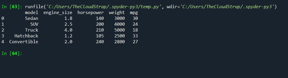
Let’s consider a scenario where we have a set of test data related to the fuel efficiency of different car models. The dataset contains various car parameters such as model, engine size, horsepower, weight, and miles per gallon (MPG).
import pandas as pd

# Sample test data as a dictionary
data = {
    'model': ['Sedan', 'SUV', 'Truck', 'Hatchback', 'Convertible'],
    'engine_size': [1.8, 2.5, 4.0, 1.2, 2.0],
    'horsepower': [140, 200, 210, 105, 240],
    'weight': [3000, 4000, 5000, 2500, 2800],
    'mpg': [30, 24, 18, 33, 27]
}

# Convert the dictionary into a pandas DataFrame
df = pd.DataFrame(data)

# Display the DataFrame
print(df)
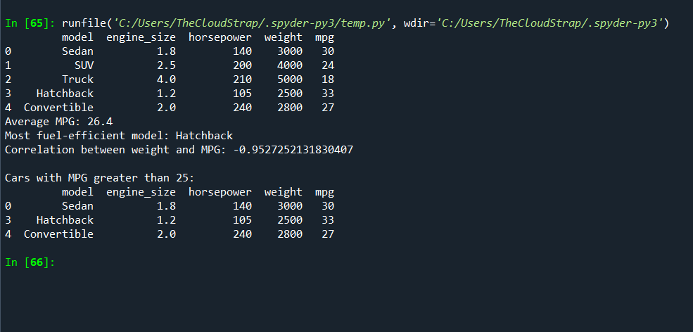
The output of this will be a table showing our car data.
Now, we can use various Pandas functions to analyze this data.
# Calculate the average MPG across all models
average_mpg = df['mpg'].mean()
print(f"Average MPG: {average_mpg}")

# Find the car model with the highest MPG
most_efficient_model = df.loc[df['mpg'].idxmax(), 'model']
print(f"Most fuel-efficient model: {most_efficient_model}")

# Find the correlation between weight and MPG
correlation = df['weight'].corr(df['mpg'])
print(f"Correlation between weight and MPG: {correlation}")

# Filter out cars with MPG greater than 25
efficient_cars = df[df['mpg'] > 25]
print("\nCars with MPG greater than 25:")
print(efficient_cars)
In this script:
- We calculate the average MPG across all car models using the mean() function.
- We find the model with the highest MPG using the idxmax() function, which returns the index of the maximum value, and we then use loc to get the model name at that index.
- We find the correlation between weight and MPG using the corr() function, which can give us an idea of whether heavier cars tend to have lower MPG.
- We filter out the cars with MPG greater than 25 using a condition inside the DataFrame’s square brackets. This returns a new DataFrame containing only the rows where the condition is true.
Pandas is a powerful tool for data manipulation and analysis. It provides efficient and intuitive ways to handle and process large datasets and is widely used in data analysis and data science tasks. In the context of automotive software testing, it can be used to analyze test results and find patterns and insights that can help improve the software.
Data visualization with Matplotlib
Matplotlib is a widely used library in Python for 2D graphics. It can generate plots, histograms, power spectra, bar charts, error charts, scatter plots, etc., with just a few lines of code.
Let’s consider an example where we have collected data about the fuel efficiency (miles per gallon), horsepower, and weight of several different car models during our automotive software testing.
We’ll use Pandas for data manipulation, and Matplotlib for data visualization. For simplicity, let’s create this data manually in this example. In a real-life scenario, this data would typically be loaded from a CSV file or a database.
import pandas as pd
import matplotlib.pyplot as plt
# Sample test data as a dictionary
data = {
'model': ['Sedan', 'SUV', 'Truck', 'Hatchback', 'Convertible'],
'horsepower': [140, 200, 210, 105, 240],
'weight': [3000, 4000, 5000, 2500, 2800],
'mpg': [30, 24, 18, 33, 27]
}
# Convert the dictionary into a pandas DataFrame
df = pd.DataFrame(data)
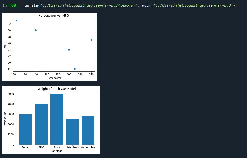
# Create a scatter plot of horsepower vs. mpg
plt.scatter(df['horsepower'], df['mpg'])
plt.title('Horsepower vs. MPG')
plt.xlabel('Horsepower')
plt.ylabel('MPG')
plt.show()
# Create a bar chart showing the weight of each car model
plt.bar(df['model'], df['weight'])
plt.title('Weight of Each Car Model')
plt.xlabel('Car Model')
plt.ylabel('Weight (lbs)')
plt.show()
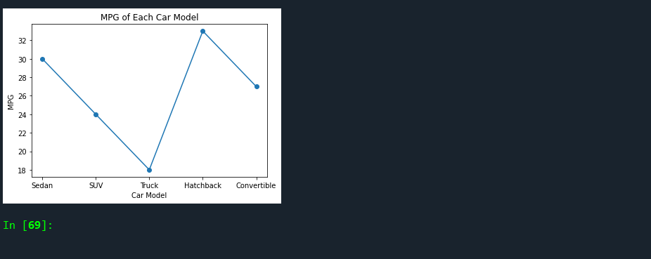
# Create a line graph of mpg for each car model
plt.plot(df['model'], df['mpg'], marker='o')
plt.title('MPG of Each Car Model')
plt.xlabel('Car Model')
plt.ylabel('MPG')
plt.show()
In this script, we’re doing the following:
- Creating a scatter plot of horsepower vs. MPG to visualize if there’s any relationship between a car’s horsepower and its fuel efficiency.
- Creating a bar chart to compare the weight of each car model. This can help us see at a glance which car models are heavier or lighter.
- Creating a line graph to show the MPG for each car model, allowing us to easily compare their fuel efficiencies.
Data visualization is a crucial part of data analysis in any field. It allows us to understand the data by placing it in a visual context and makes complex data more understandable, accessible, and usable. Matplotlib, combined with Pandas, is a powerful tool that can help us in our automotive software testing by providing insights and helping us to spot trends, patterns, and outliers.
Let’s dive into an example in which we are using Python’s Matplotlib library for data visualization within the context of automotive software testing.
Suppose we have gathered data on a fleet of test vehicles, and we are specifically interested in analyzing how variables such as speed, fuel efficiency, and temperature affect the overall performance of the vehicles’ engines.
We will use Pandas for data manipulation and Matplotlib for data visualization. Let’s consider a simplified situation where we manually create the data, although, in real scenarios, you’d be pulling this data from a much larger dataset or database.
import pandas as pd
import matplotlib.pyplot as plt
# Simulated test data
data = {
'vehicle_id': [1, 2, 3, 4, 5, 6, 7, 8, 9, 10],
'average_speed': [45, 55, 50, 60, 70, 55, 65, 60, 55, 50],
'fuel_efficiency': [20, 25, 22, 21, 19, 24, 21, 23, 25, 22],
'average_engine_temp': [170, 175, 172, 176, 174, 175, 173, 172, 174, 175]
}
# Create a DataFrame
df = pd.DataFrame(data)
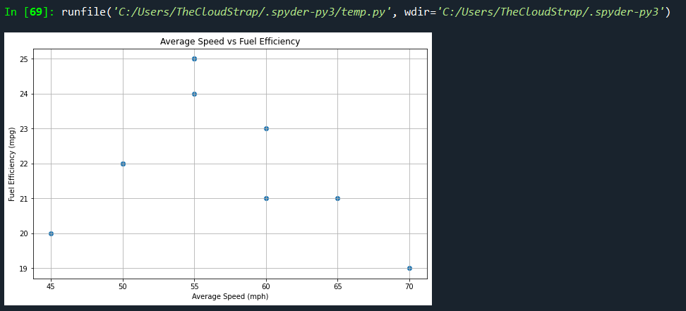
# Create a scatter plot of speed vs fuel efficiency
plt.figure(figsize=(10, 6))
plt.scatter(df['average_speed'], df['fuel_efficiency'])
plt.title('Average Speed vs Fuel Efficiency')
plt.xlabel('Average Speed (mph)')
plt.ylabel('Fuel Efficiency (mpg)')
plt.grid(True)
plt.show()
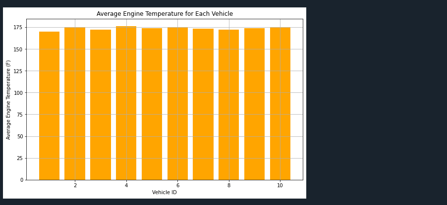
# Create a bar graph of engine temperature for each vehicle
plt.figure(figsize=(10, 6))
plt.bar(df['vehicle_id'], df['average_engine_temp'], color='orange')
plt.title('Average Engine Temperature for Each Vehicle')
plt.xlabel('Vehicle ID')
plt.ylabel('Average Engine Temperature (F)')
plt.grid(True)
plt.show()
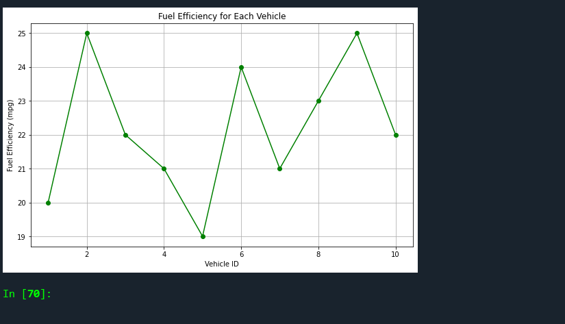
# Create a line graph of fuel efficiency for each vehicle
plt.figure(figsize=(10, 6))
plt.plot(df['vehicle_id'], df['fuel_efficiency'], marker='o', linestyle='-', color='green')
plt.title('Fuel Efficiency for Each Vehicle')
plt.xlabel('Vehicle ID')
plt.ylabel('Fuel Efficiency (mpg)')
plt.grid(True)
plt.show()
Here’s what we’re doing with this script:
- Creating a scatter plot that shows the relationship between average speed and fuel efficiency. This will allow us to see if the vehicles maintain fuel efficiency as speed increases, or if there’s a different trend.
- Creating a bar graph that displays the average engine temperature for each vehicle. This can help us spot if any vehicles are consistently running hotter than the others.
- Making a line graph that displays the fuel efficiency for each vehicle, allows us to compare fuel efficiencies easily.
By visualizing this data, we can more easily identify patterns, outliers, and relationships between variables, which can help inform the software testing process in the automotive industry. Matplotlib is a versatile library in Python that allows for such complex visualizations, making it an indispensable tool in any data analyst’s toolkit.

This post was published by Admin.
Email: admin@TheCloudStrap.Com